
Since we get asked just about daily when Hum is coming out, how about a status update? Hum is in active development. We’re shooting for somewhere around Thanksgiving for a 1.0 release.
Some changes
Hum has been redesigned for iOS7. We are no longer using the red/orange color in our icon and title bar since the built-in app for Music / iTunes is so similar.
We didn’t want any confusion between our icons.
We’ve switched to a turquoise that was originally used as a secondary color in our branding.
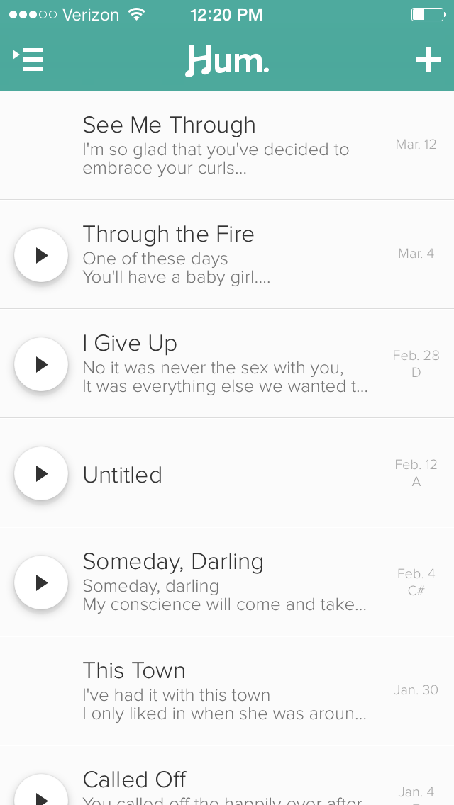
Hum today, straight from our test device.
You can see things are thinner, flatter, more productive. Comfortable. Not drinking too much. Regular exercise at the gym (Three days a week). We’re using iOS7’s blurring and motion whenever possible. It feels right at home—so much so that we’ll be going exclusively iOS7. This means that Hum will be forward-looking and will only be supported on iPhone 4 and above.
We’ve simplified mood and sound sorting. You can now drag a slider somewhere between happy and sad icons, allowing for more personalized categorization. This in combination with a slider between quiet and loud will offer some powerful categorization of your lyrics and melodies. The icons were kept vague enough that these sliders could represent all kinds of emotion and sound. The sound slider, for example, could be used as slow vs. fast in your library if you wanted.
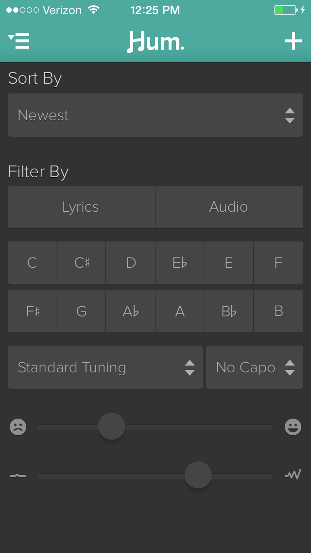
If you’re a wimp capo user, you can also tell Hum which fret you had your capo on.
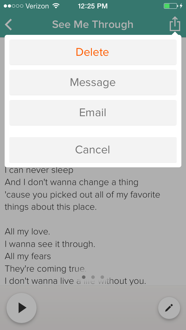
You’ll be able to share your songs as Messages and Emails.
Hum will be in your hands soon. Sit tight! You couldn’t be any more excited than we are!